Experimenting with the face and fur a bit to try and incorporate the red ribbon/cape design from the coat of arms.
Friday, 28 February 2014
Adaptation - Designing the characters head/horns
Trying to figure out the design of the horns by incorporating different types of musical notes and instruments. I enjoy the design of number one with the harp looking horns as an antelope represented as musically talented and symbolize harmony and peace and I feel harps are seen as harmonious instruments which fits the character.
Wednesday, 26 February 2014
Adaptation - looking For a Style
Trying to find a style to keep it consistent for when I put more detail into the character, as the horns and design on the fur and props are yet to be designed. First of all I tried a more anatomical design, compared to number two where I made it more chibi like, but in the number three I attempted to mix it with a bit of both by exaggerating parts of the body to give more character. Overall I like the direction number three is going in.
Adaptation - Idea, Research and Influences
For my main project of Adaptation I intend to take a Coat of Arms and personify it into a character, Through research I found what certain parts on a coat of arms symbolize which I will use to help me personify the coat of arms and design the character.


Looking through book on heraldry I found parts that could be quite useful helping me know what time the coat of arms was created and the origin of its creation, there was also a part on colours that are used in a coat of arms, which can help towards picking out a colour palette.
I intend for the design of my character to be less on the serious side and more humorous, Which lead to me finding inspiration from the artist David Colman who takes animal and exaggerates them creating unique fun looking characters, as well as that in some characters he incorporates designs into their fur/ body to make it look like clothing which gave me the idea to take parts from the coat of arms to incorporate it onto the character.
Thursday, 20 February 2014
Friday, 7 February 2014
Tuesday, 4 February 2014
Probs/Objects
Just some props/objects that will be in the info-graphic.
I wasn't too sure on if the money should of had a sign on it or what sign it would have, thinking about it now I feel it should have a sign, possibly number two.
Front and Side view of the Lady
Looking For a Background
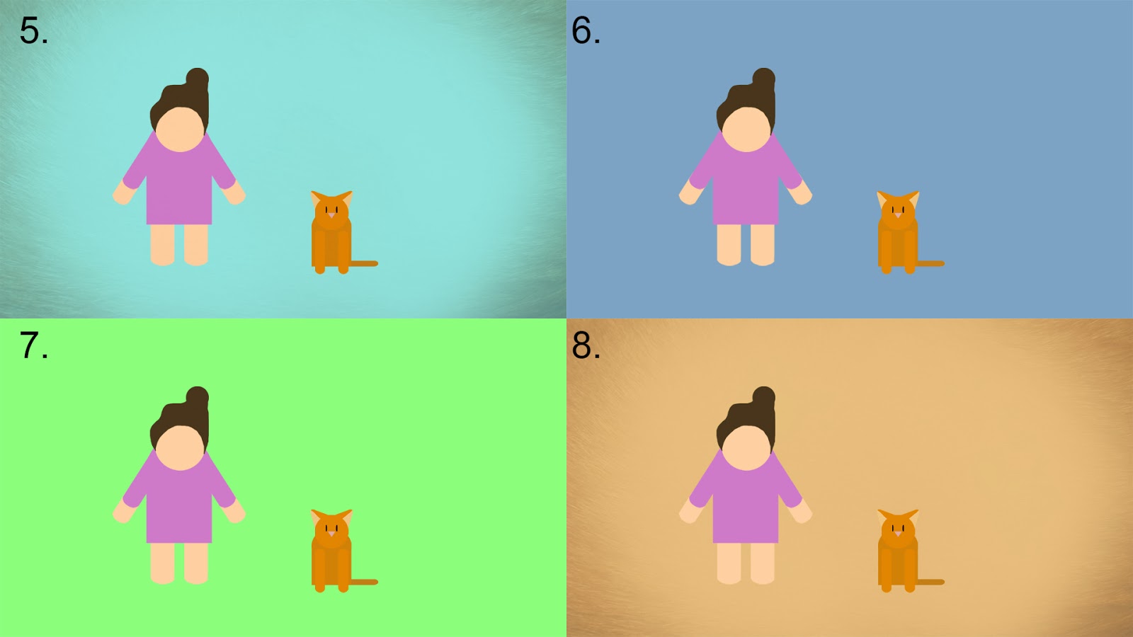
Multiple background tests, I wasn't sure on if I wanted it to be a pure white background but the world felt very empty without some kind of texture or colour in the background. Personally I like two, opinions would be appreciated?
Looking For a Font
Searching for multiple Fonts I managed to find a few that I liked, My favourite Is number three it seems to stand out the most for me. (the font wont be in this colour when in the info-graphic)
Sunday, 2 February 2014
Subscribe to:
Comments (Atom)


